
Technical analysis has long been used by traders, analysts, and investors and has received broad acceptance from regulators and the academic community, particularly with regard to its behavioral finance aspects. Although certain aspects of technical analysis, such as the calculation of indicators, have specific rules, the interpretation of findings is often subjective. This reading covers some of the main tools used in technical analysis.
Technical analysis is a form of security analysis that uses price and volume data in decision making. The data is often graphically displayed in the form of charts. These charts are analyzed using various indicators to identify investment opportunities. Technical analysis allows us to see a battle between buyers and sellers, and predict which side may win.
Technical analysis is based on the following logic:
Technical analysis of any financial instrument does not require detailed knowledge of that instrument. Technical analysis can be applied to any time frame – short term and long term. Although technical analysis is commonly used for short-term trading or tactical asset allocation decisions, analyzing long-term charts can assist in making long-term investment decisions or strategic asset allocation decisions.
The three main principles of technical analysis are:
The market discounts everything: A core assumption of technical analysis is that the price already reflects all known factors impacting a financial instrument. i.e. at any point in time, a stock’s price already reflects its fundamentals – balance sheet, income statement, cash flow statement, as well as broad economic factors and market psychology.
Prices move in trends and countertrends: Technical analysis assumes that prices follow trends – upward, downward, sideways or a combination of these. Once a trend is identified, we can expect future price movements to follow the trend rather than go against it. A common saying among technical analysts is – “The trend is your friend”.
Price action is repetitive, and certain patterns tend to reoccur: Technical analysis assumes that due to market psychology, price movements repeat. These repetitions in price movements can be charted, and patterns that are likely to repeat can be identified.
Behavioral finance deals with the influence of psychology on the behavior of investors. Technical analysis can be thought of as the study of collective investment psychology or sentiment and is thus directly related to behavioral finance. It assumes that the market reflects the collective knowledge and sentiment of many participants such as investors, hedgers, insiders, and other stakeholders. The greater the volume of a participant’s trades, the more impact the participant will have on price. By studying market technical data (price and volume trends), technicians seek to understand investor sentiment.
Fundamental theorists believe that markets are rational and efficient. On the other hand, technicians believe that human behavior is often erratic and driven by emotion. Therefore, they believe that market trends and patterns reflect this irrational human behavior. They rely on recognition of such trends and patterns in the past to project future patterns of security prices.
Chart patterns are a graphic representation of human trading activity. Chart patterns have predictive power because human behavior is often repeated, for example, fear during market sell-offs or greed during market bubbles.
Some financial instruments have an associated income stream that adds to the security’s intrinsic value such as coupon payments for bonds and dividends for equity shares. A fundamental analyst can use these cash flows to arrive at a present value of the security. However, for other assets such as commodities, which do not have underlying income streams or financial statements, technical analysis is commonly used.
Technical and fundamental analyses approach the market in different ways, but are both useful. Key differences between the two are listed below:
Drawbacks of technical analysis are:
Although the two approaches seem opposing, in practice, many investors combine technical analysis and fundamental analysis to make better investment decisions.
Technical analysis works best in liquid and deep markets. In illiquid markets and markets that are subject to large outside manipulation (such as actions of central banks), the application of technical analysis is limited.
Technical analysis can be applied to different asset classes such as: equities, commodities and currencies.
Market participation (retail vs. institutional) can also have an impact on technical analysis. Retail investors tend to have less in-dept information and may depend on technical analysis and momentum trading more than institutional investors. Institutional investors have limited interest in small and micro-cap stocks that do not offer enough liquidity.
Market inefficiencies can result in strong trend periods, and inefficiencies can be more easily exploited in emerging and frontier markets.
The primary tools used in technical analysis are charts and indicators. Charts are graphical displays of price and volume data. Indicators are approaches to analyzing the charts. These tools may be used on an individual basis, but the best results are obtained by combining different techniques.
The various types of charts used in technical analysis are:
Line chart
Line charts are a simple graphic display of price trends over time. Line charts are usually drawn with closing prices as the data points. Many traders consider the closing price as the most important data point, because it reflects the final decision for that period’s transactions.
An example of a line chart is shown below. The vertical axis (y axis) represents price level and the horizontal axis (x axis) is time. The line chart shows that the price of the stock during the first upward movement of the price is higher than the second high.

Bar chart
A line chart has only one data point per time interval. A bar chart, in contrast, has four bits of data in each entry – the opening and closing prices, and the high and low prices during the period.
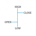 |
Bar chart notation
The figure on the left shows how the data point for each interval is constructed. A vertical line connects the high and low price for the day. A cross-hatch to the right indicates the closing price, and a cross-hatch to the left indicates the opening price. |
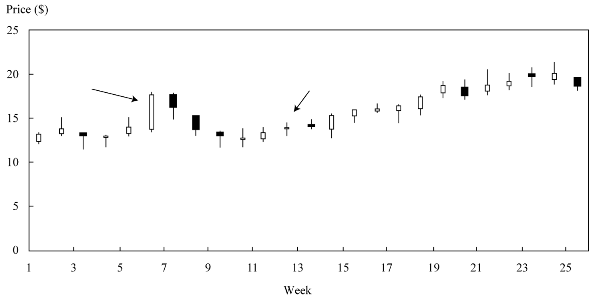
A short bar indicates little price movement while a long bar indicates a wide divergence between the high and the low for the day. An example of a bar chart is shown in the figure below:
Candlestick chart
A candlestick chart also provides four prices per data entry point: the opening and closing prices, and the high and low prices during the period.
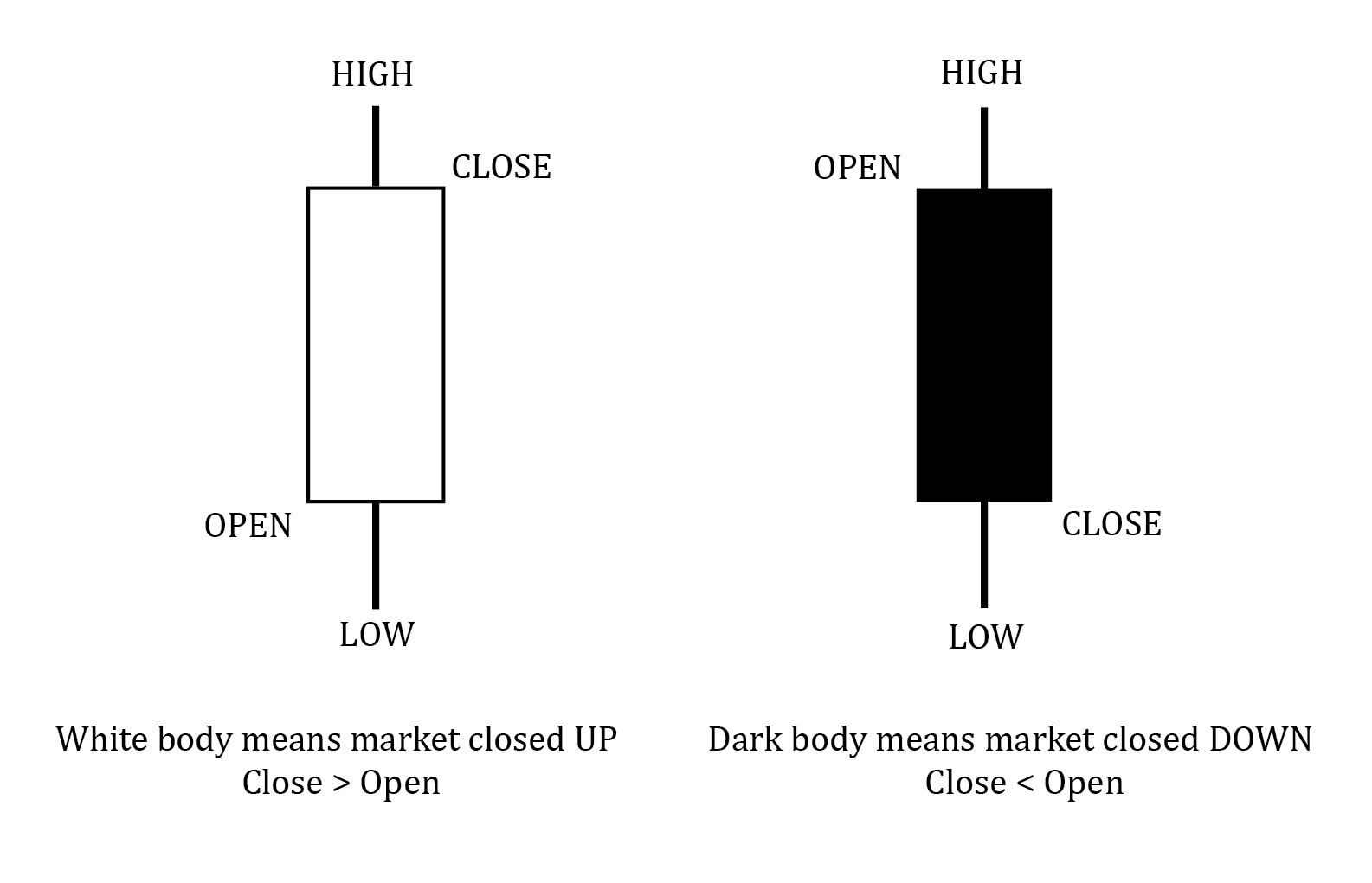
The body of the candle is either white or shaded. A white body means that the market closed up. A shaded body means that the market closed down. An example of a candlestick chart is shown below:
An advantage of the candlestick chart over the bar chart is that price moves are much more visible, which allows for faster analysis.
Scale
The vertical axis can be constructed with either:
A logarithmic scale is suitable for longer time frames, whereas a linear scale is suitable for shorter time frames.
The horizontal axis usually shows the passage of time. The appropriate time interval depends on the nature of the underlying data. We can have 5-min, 30-min, 1-hour, daily, weekly or even monthly charts.
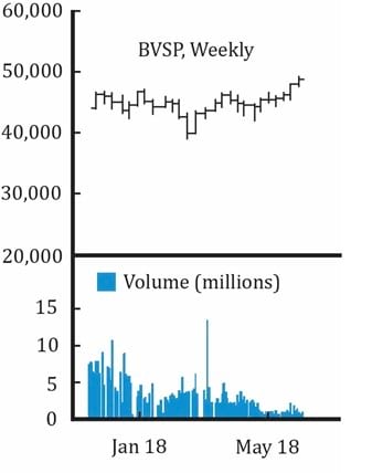
Volume charts
They are often displayed below a line, bar or candlestick chart. The number of units of the security traded is plotted on the Y-axis and time on the X-axis.
Volume is an important element in technical analysis and is generally used to confirm a trend, as it indicates the strength of the buyers and sellers.
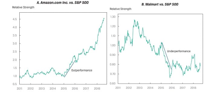
Relative strength analysis
Relative strength analysis is used to compare the performance of a particular asset, such as a stock, with that of some benchmark index or the performance of another stock. Typically, the analyst prepares a line chart of the ratio of the two prices, with the asset under analysis as the numerator and the benchmark or other security as the denominator. A rising line shows that the asset is performing better than the benchmark; a declining line shows that the asset is underperforming. A flat line shows neutral performance.
In the figures below, the performances of two stocks — Amazon and Walmart are compared to the S&P 500 index using relative strength analysis. Amazon has generally outperformed the benchmark. Whereas, Walmart has generally underperformed the benchmark.
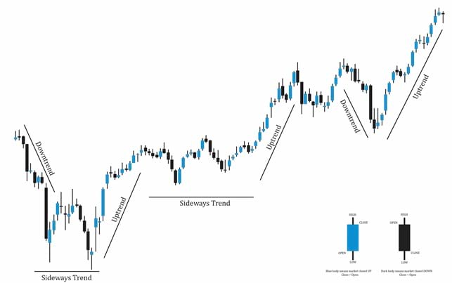
A trend is a long-term pattern of price movements in a particular direction. When a security is not trending, it is said to be in consolidation. Trend analysis is based on the observation that market participants tend to act in herds and that trends tend to stay in place for some time.
Uptrend
A security is said to be in an uptrend if prices are reaching higher highs and higher lows. An upward trendline can be drawn by connecting the increasing low points with a straight line. An uptrend indicates that the demand is more than supply.
Downtrend
A security is said to be in a downtrend if prices are reaching lower highs and lower lows. A downward trendline can be drawn by connecting the decreasing high points with a straight line. A downtrend indicates that the supply is more than demand.
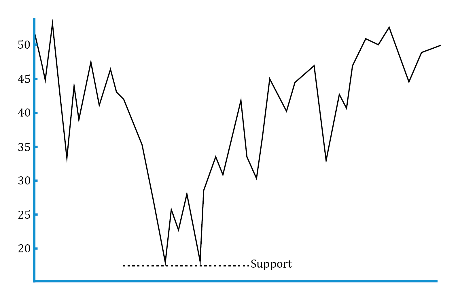
Support
It is the price level at which there is sufficient buying pressure to stop a further decline in prices.
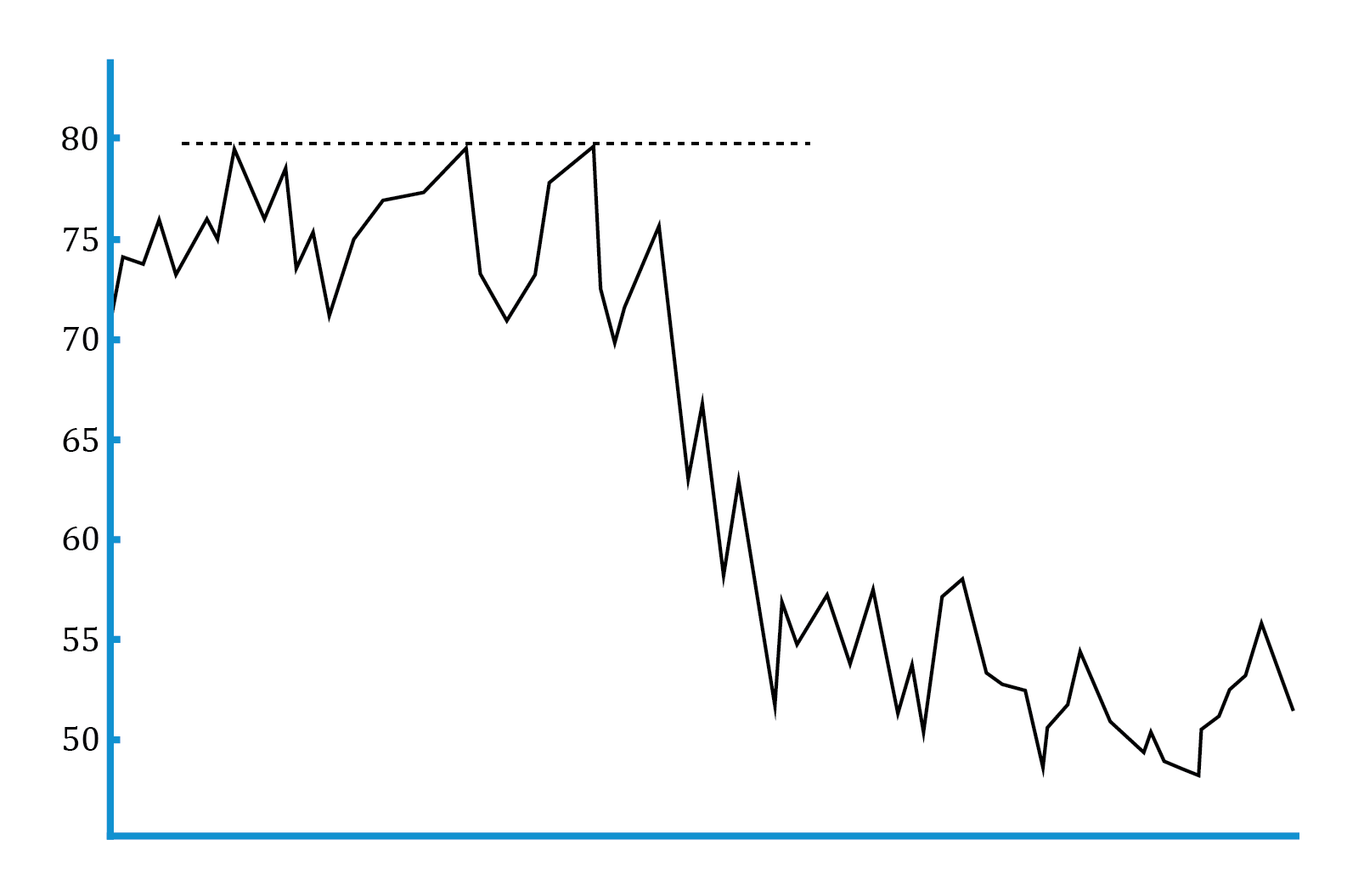
Resistance
It is the price level at which there is sufficient selling pressure to stop a further increase in prices.
Change in polarity
Once a support level is breached, it often becomes a new resistance level. Similarly, once a resistance level is breached; it often becomes a new support level.
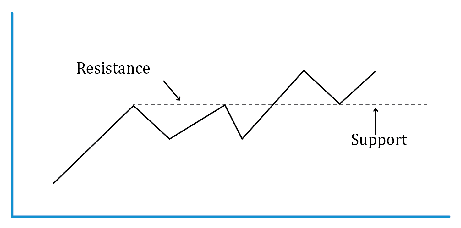
Chart patterns are formations that create a recognizable shape; common patterns appear repeatedly and lead to similar subsequent price movements. Chart patterns can be divided into two categories: reversal patterns and continuation patterns.
They signal the end of a trend. The four kinds of reversal patterns are:
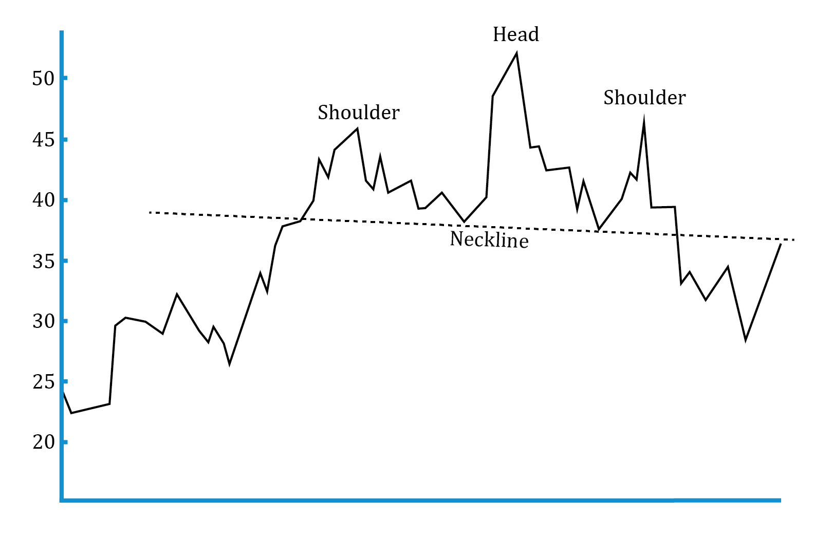
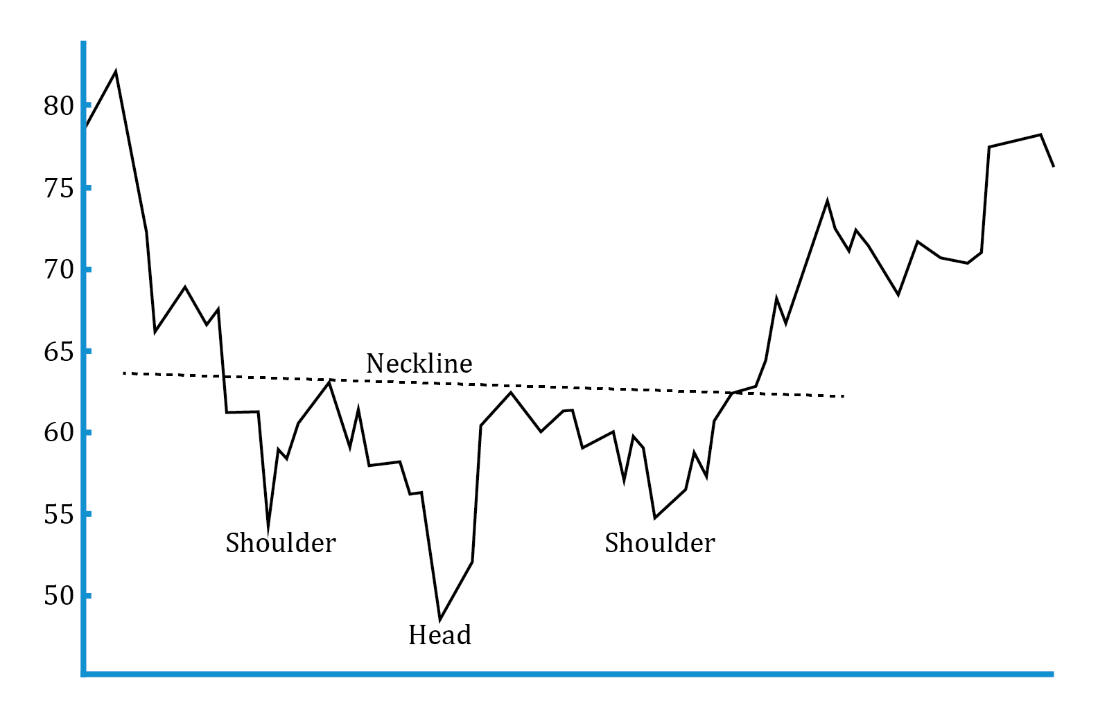
Head and shoulders pattern:
It consists of the left shoulder, the head, and the right shoulder. This pattern indicates the end of an uptrend especially if the second shoulder has the lowest volume. We can profit by going short on the security, the price target is:
Price target = neckline – (head – neckline)
Inverse head and shoulders pattern:
It is a mirror image of the head and shoulders pattern. This pattern indicates the end of a downtrend. We can profit by going long on the security, the price target is:
Price target = neckline + (neckline – head)
Example
In an inverted head and shoulders pattern, if the neckline is at €125, the shoulders at €80, and the head at €95, the price target is closest to which of the following?
Solution:
Inverted Head and shoulder patter target price = Neckline + (Neckline – Head)
Target Price = 125 + (125 – 95)
Target Price = 155
Double tops and bottoms:
A double top is formed when prices hit the same resistance level twice and fall down. It indicates the end of an uptrend. Typically, the second high will have lower volumes than the first high.
A double bottom is formed when prices bounce back from the same support level twice. It indicates the end of a down-trend.
As with the head and shoulders pattern, the size of the double top or double bottom is used to set price targets.
Triple tops and bottoms:
Triple tops are formed when prices hit the same resistance level thrice.
Triple bottoms are formed when prices bounce back from the same support level thrice.
They signal a temporary pause in the trend, and that the trend will continue in the same direction as before. The four kinds of continuation patterns are:
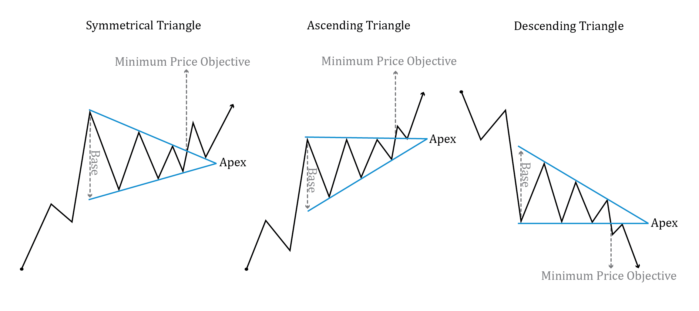
Triangles:
One trendline connects the highs and a second trendline connects the lows. As the distance between the highs and lows narrows, the trendlines converge, forming a triangle. There are three forms – ascending triangles, descending triangles, and symmetric triangles.
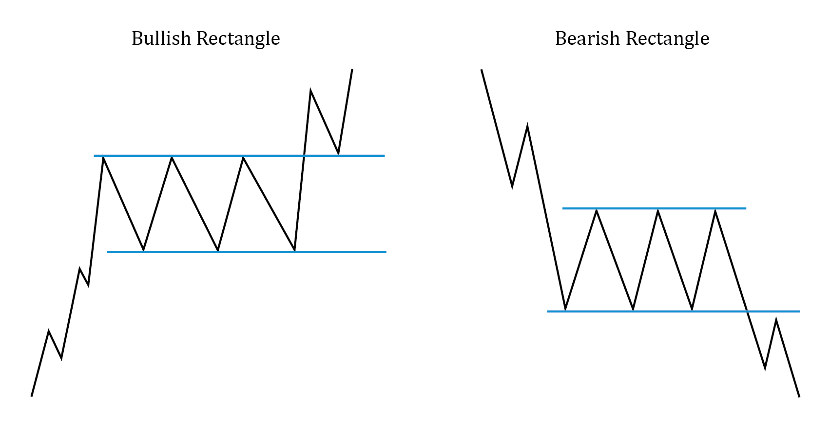
Rectangles:
One trendline connects the highs and a second trendline connects the lows. As the distance between the highs and lows is constant, the trendlines are parallel to each other and form a rectangle.
Flags:
They are similar to a rectangle and are formed by two parallel trendlines. However, they form over a much shorter time interval.
Pennants:
They are similar to a triangle and are formed by two converging trend lines. However, they form over a much shorter time interval.


Ace the Exam with Active Learning!

Ace the Exam with IFT Notes!

Practice your way to success!
 Do IFT Mocks to make you exam-ready!

Accelerate your studies!


Sign up to get more!