
A contingency table is a tabular format that displays the frequency distributions of two or more categorical variables simultaneously. It can be used to find patterns between the variables.
Contingency tables are constructed by listing all levels of one variable as rows and all the levels of the other variables as columns in a table. For example, consider a contingency table created for a portfolio of 500 stocks based on two variables – sector and market capitalization.
| Market Capitalization Variable
(3 Levels) |
||||
| Sector Variable
(4 Levels) |
Small | Mid | Large | Total |
| Financial | 44 | 38 | 20 | 102 |
| FMCG | 130 | 54 | 46 | 230 |
| Information Technology | 57 | 34 | 21 | 112 |
| Real estate | 30 | 16 | 10 | 56 |
| Total | 261 | 142 | 97 | 500 |
Key points to note from the table are:
Contingency tables can also be created using relative frequencies based on total count. Each number is expressed as percentage of the total number of stocks. For example, small cap FMCG stocks are 130 / 500 = 26% of the portfolio.
Applications
One application of contingency tables is for evaluating the performance of a classification model (using a confusion matrix). Suppose we have a model for classifying companies into two groups: those that default on their bond payments and those that do not default. The table below shows a confusion matrix for a sample of 1,000 non-investment-grade bonds.
| Predicted Default
|
Actual Default | Total | |
| Yes | No | ||
| Yes | 150 | 10 | 160 |
| No | 6 | 834 | 840 |
| Total | 156 | 844 | 1,000 |
The table shows that the classification model incorrectly predicts default in 10 cases where an actual default did not occur. It also incorrectly predicts no default in 6 cases where a default did actually occur.
Another application of contingency tables is to investigate a potential association between two categorical variables. One way to test the potential association is to follow a three-step process:
These steps are demonstrated in the following example.
Example: Contingency Tables and Association between Two Categorical Variables
Suppose we randomly pick 200 mutual funds and classify them based on two parameters:
This data is summarized in a 2 x 2 contingency table shown below.
| Low Risk | High Risk | |
| Growth | 67 | 19 |
| Value | 98 | 16 |
Solution to 1:
The marginal frequency for growth is 67 + 19 = 86
The marginal frequency for value is 98 + 16 = 114
Solution to 2:
The marginal frequency for low risk is 67 + 98 = 165
The marginal frequency for high risk is 19 + 16 = 35
Solution to 3:
To conduct a chi-square test of independence, we perform the following three steps.
Step 1: Add the marginal frequencies and overall total to the contingency table. We also show the relative frequency table for observed values.
| Observed Values | Observed Values | |||||||
| Low Risk | High Risk | Low Risk | High Risk | |||||
| Growth | 67 | 19 | 86 | Growth | 78% | 22% | 100% | |
| Value | 98 | 16 | 114 | Value | 86% | 14% | 100% | |
| 165 | 35 | 200 | ||||||
Step 2: Use the marginal frequencies to construct a table with expected values of the observations.
Expected Valuei,j = (Total Row i × Total Column j)/Overall Total
For example,
Expected value for Growth / Low Risk is: (86 x 165) / 200 = 70.95
Expected value for Value / High Risk is: (114 x 35) / 200 = 19.95`1 qA
The table of expected values and the corresponding relative frequency table is presented below:
| Observed Values | Observed Values | |||||||
| Low Risk | High Risk | Low Risk | High Risk | |||||
| Growth | 70.95 | 15.05 | 86 | Growth | 82.5% | 17.5% | 100% | |
| Value | 94.05 | 19.95 | 114 | Value | 82.5% | 17.5% | 100% | |
| 165 | 35 | 200 | ||||||
Step 3: The actual values and the expected values are used to derive the chi-square test statistic. This is then compared to a value from the chi-square distribution table for a given level of significance. If the test statistic is greater than the chi-square distribution value, then we can conclude that there is significant association between the categorical variables.
Instructor’s Note: You will understand this step better when you go over the reading on ‘Hypothesis Testing’.
Visualization refers to the presentation of data in pictorial or graphical format to aid understanding of the data and for gaining insights into the data. There are multiple data visualization techniques, which are covered in the following sub-sections.
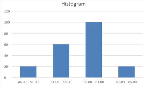
Histogram: A histogram presents the distribution of numerical data by using the height of a bar to represent the absolute frequency of each bin. The advantage of the visual display is that we can quickly see where most of the observations lie.
Suppose we are evaluating 200 stocks presented in the following frequency distribution table.
| Price Range | Number of Stocks |
| 46.00 – 51.00 | 20 |
| 51.00 – 56.00 | 60 |
| 56.00 – 61.00 | 100 |
| 61.00 – 65.00 | 20 |
We can depict this data graphically through a histogram.
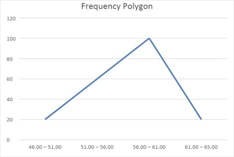
Frequency polygon:
A frequency polygon plots the midpoints of each interval on the X-axis and the absolute frequency of that interval on the Y-axis. Each point is then connected with a straight line.
Cumulative frequency distribution
Another graphical tool is the cumulative frequency distribution chart. Such a graph can plot either the cumulative frequency or cumulative relative frequency against the upper interval limit. The cumulative frequency distribution allows us to see how many or what percent of the observations lie below a certain value. The figure below is an example of a cumulative frequency distribution.
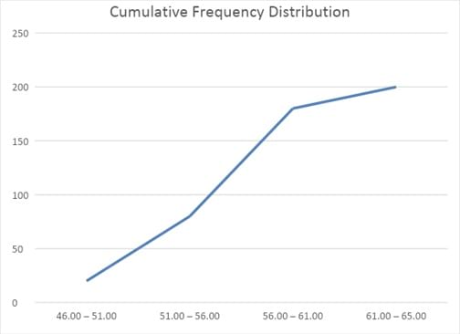
Notice that the slope is steep in the ‘51.00 -56.00’ to ’56.00 – 61.00’ segment because a large number of stocks (100) are added. The slope flattens out in the last segment because only 20 stocks are added in the last segment.
Example:
Which of the following statements is most likely to be inaccurate about histograms?
Solution:
C is correct. In a histogram, the height represents the absolute frequency for each interval.
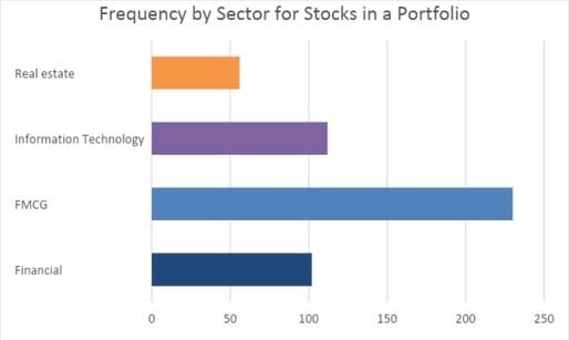
A bar chart is used to plot the frequency distribution of categorical data. Each bar represents a distinct category, and the bar’s height is proportional to the frequency of that category.
The bar chart below shows that the sector in which the portfolio holds the most stocks is FMCG, with 230 stocks, followed by the IT sector, with 112 stocks.
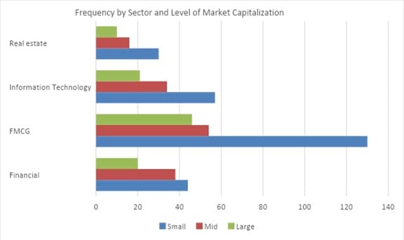
A grouped bar chart (also called a clustered bar chart) can be used to show the frequency distribution of multiple categorical variables simultaneously.
The chart below shows that small cap FMCG stocks have the highest frequency – 130. Also, we can easily observe that small cap stocks are the largest sub-group within each sector.
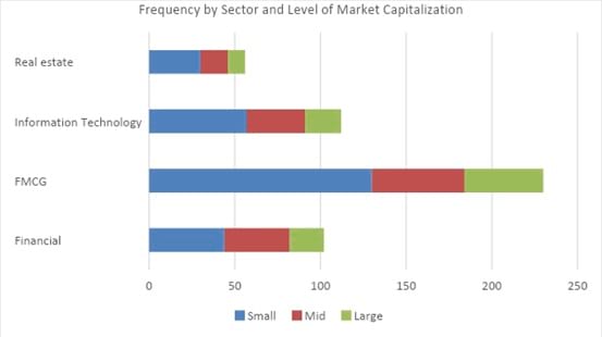
A stacked bar chart is an alternative form for presenting the frequency distribution of multiple categorical variables simultaneously.
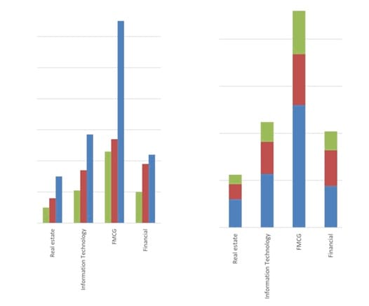
Bar charts can also be presented vertically instead of horizontally as shown below. Normally, the height of each bar is proportional to the value it depicts. However, sometimes the y-axis may be truncated, in which case the heights may not be proportional to the depicted values. In such cases, the graph needs to be evaluated more carefully.


Ace the Exam with IFT Notes!

Ace the Exam with Active Learning!

Practice your way to success!
 Do IFT Mocks to make you exam-ready!

Accelerate your studies!


Sign up to get more!