
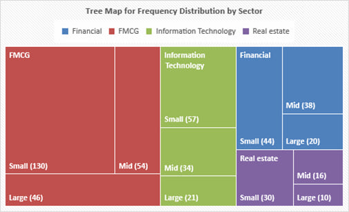
A tree-map is a graphical tool to display categorical data. It comprises of a set of colored rectangles to represent distinct groups. The area of each rectangle is proportional to the value of the corresponding group. Additional dimensions of categorical data can be displayed by a set of nested rectangles.
A word cloud (also known as a tag cloud) is a visual device for representing textual data. The size of each word is proportional to the frequency of the word in the given text.
A sample word cloud is show below.

Sometimes color can be used to add another dimension. For example, for a word cloud based on analyst reports related to a particular company, different colors can be used for positive, negative and neutral sentiment words. Positive sentiment can be depicted by the color ‘green’. Negative sentiment can be depicted by the color ‘red’ and neutral sentiment can be depicted by the color ‘blue’.
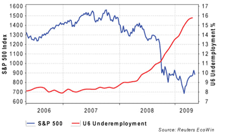
A line chart is a type of graph used to visualize ordered observations. It is often used to display the change of data series over time. A line chart can plot more than one set of data points, which helps in making comparisons. A sample line chart is shown below. After the 2008 crisis, stock prices dropped and unemployment rose.
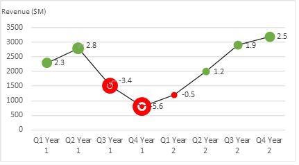
A bubble line chart is a special type of line chart that uses varying-sized bubbles as data points to represent an additional dimension of data.
The following chart plots the quarterly revenue and EPS for a company over a two-year period. The x-axis represents time and the y-axis represents revenue. The line represents revenue. Each revenue data point is replaced by a circular bubble representing the EPS in the corresponding quarter. The size of the bubbles are proportional to the magnitude of the EPS. The bubbles are also color coded – red represents losses and green represents profits.
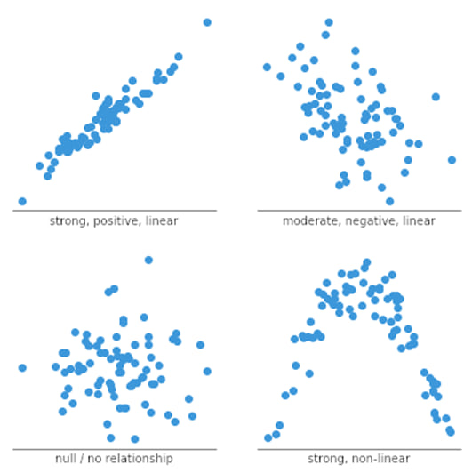
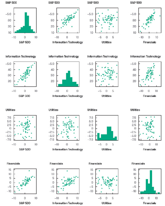
A scatter plot is a type of graph used to visualize the joint variation in two numerical variables. It is constructed with the x-axis representing one variable and the y-axis representing the other variable. Dots are drawn to indicate the values of the two variables at different points in time.
The pattern of a scatter plot may indicate no relationship, linear relationship or a non-linear relationship between the two variables. In case of a linear relationship, a positive slope indicates that the variables move in the same direction; whereas a negative slope indicates that the variables move in opposite directions.
A scatter plot matrix organizes scatter plots between pairs of variables into a matrix format. This makes it easy to inspect all pairwise relationships in one combined visual.
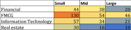
A heat map is a type of graphic that organizes and summarizes data in a tabular format and represents it using a color spectrum.
Heat maps are often used in displaying frequency distributions or visualizing the degree of correlation among different variables.
A sample heat map for a portfolio is shown below. Cells in the chart are color coded to differentiate high values from low values. Blue represents lower values whereas orange represents higher values.
The intended purpose of visualizing data (i.e., whether it is for exploring/presenting distributions or relationships or for making comparisons) is the main factor that helps select the appropriate chart type.
To explore/present relationships between variable we can use the following visualization types:
To explore/present distributions we can use the following visualization types:
To make comparisons we can use the following visualization types:
Common pitfalls
Four common pitfalls that should be avoided are:


Ace the Exam with Active Learning!

Ace the Exam with IFT Notes!
 Do IFT Mocks to make you exam-ready!

Accelerate your studies!

Practice your way to success!


Sign up to get more!